.png)
Paving the way for a food truck ordering experience.
Defining a product vision and solution through user centered design.
Summary:
I designed "Truckin' Eats" — a seamless online ordering platform for food truck lovers and busy professionals. The challenge was to create a solution from the ground up that streamlines group orders, enables pre-ordering, and offers a simplified search to find your favorite food trucks. This case study outlines my approach from empathizing with users to creating user-centric designs.
Primary Role:
Lead UX Designer
Timeframe:
August '23 - January '24
Empathy: Understanding the Food Truck Market

Diving into the Food Truck Craze: Secondary research revealed a booming U.S. food truck market, poised for growth with a projected 6.4% CAGR from 2022 to 2030. Despite the rise of mobile food ordering apps, a gap existed for food trucks lacking online ordering capabilities.

Tuning into User Desires: Insights from a 2023 study underscored the craving for visually appealing and easy-to-navigate online food services. This was my beacon to tailor Truckin' Eats not just as a solution but as a delightful experience.

Voices from the Street: Firsthand user interviews helped identify our core users: young working adults arranging group meals and dedicated foodies tracking down their favorite food trucks. A common frustration was the inconvenience of waiting in line, compounded by the complexities of large group orders, and finding a food truck’s location.
Armed with Research Feedback, I Refined my Focus on the Problem:
Persona Development: Diving deep into our user base, I mapped out personas reflecting the diverse needs of our audience, laying the groundwork for a tailored solution.


Journey Mapping: Visualizing the end-to-end user experience, I pinpointed critical intervention points to elevate the food truck ordering process.
Ideate: Mapping out Possibilities by Way of Competitive Analysis & User Flows
An exhaustive competitive audit of direct and indirect competitors provided a clear picture of the landscape, informing our value proposition. This phase was pivotal in differentiating "Truckin' Eats" from existing offerings. User flows and storyboards helped reveal potential paths to solve our target users's problems.
Prototype and Design: Sketching a New Route
Site Map: Starting with defining information architecture, I built a site map that focused on our personas key objectives and tasks. For example, finding nearby trucks and ordering is the primary task for users and is accessible from the homepage.

Paper wireframes: With paper sketches, I explored various layouts and features that addressed our personas' goals. Creating multiple sketches for each screen allowed me to quickly discover key components that were best suited to solve the users’ problems before moving to digital wireframes.


Digital Wireframes: These initial concepts evolved into digital wireframes, carefully crafted to reflect our users' needs and competitive insights. I iterated on the screen variations for the mobile and desktop web experience to explore any adjustment that would need to be made.


Prototypes: The prototype phase culminated in high-fidelity mockups and interactive prototypes, ready for more usability testing.

Taste Test and Iterate: Refining the Design
User feedback sessions were akin to taste tests — each observation and suggestion refining the app's flavor, making it more intuitive and accessible. Moderating usability studies and facilitating design critiques, I gathered actionable insights, leading to significant design improvements such as enhanced truck details, streamlined ordering processes, and clearer visual hierarchy in menu items.
I added more truck details, made the copy easier to read, and added an order button on each truck card. The goal was to make it faster to compare food trucks with critical information and start the ordering process.


I added more important details about each food item to avoid additional step for users, deemphasized the images as some food truck may not have images, and rearranged the Review Order button which made it easier to find and see confirmations when an additional item was added.
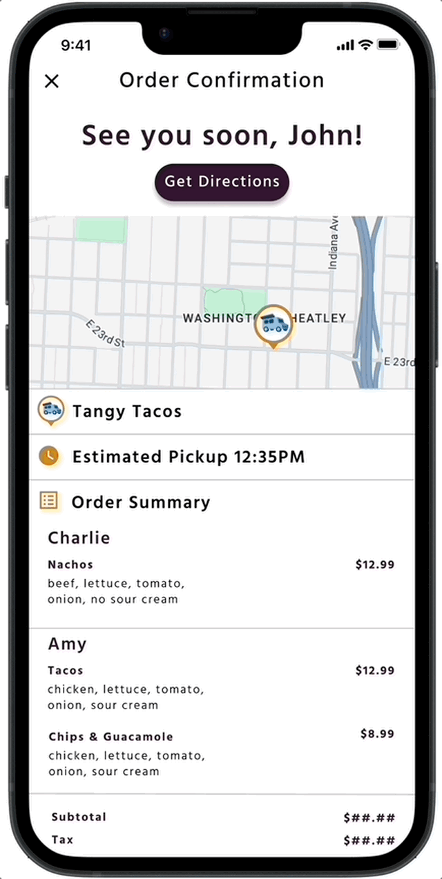
Final Solution Ready to Serve
The final solution is a user-centric online food truck ordering platform with key features tailored to our target users: an intuitive search for nearby food trucks, straightforward online ordering, and collaborative group order functionality. Each function is designed to be familiar and enrich the food truck ordering experience.
Nearby Trucks, No Problem.
Effortlessly locate nearby food havens or search for your favorite cuisines, all displayed on an interactive map that guides you to your next culinary adventure.
Get to know each truck with a tap - their hours, specialties, and even a sneak peek at their menu with mouthwatering images.
It's not just finding food; it's about discovering your city's moving feasts, one flavor at a time.


Reflections and the Road Ahead
User Feedback and Future Directions
-
Savoring User Feedback: The overwhelming positivity from our test users was a testament to Truckin' Eats' potential for saving time. They also highlighted how it would be great to use it at festivals where more food trucks are available, and they were surprised something like this was not already available.
-
Lessons Served Hot: I learned to be humble when receiving design feedback and to not fall in love with your own design but rather the users’ problem that you are trying to solve. This will make it easier to stay open to new ideas that will make for improved designs and better outcomes for our users.
-
Next on the Menu: Exploring the needs of food truck owners to make Truckin' Eats their platform of choice and making sure it serves their business objectives. Also, further refining the design based on user feedback, and breaking language barriers to make the app universally welcoming.
Interested in learning more?
Feel free to reach out on LinkedIn, email me at eggamradt@gmail.com or contact me below.